

-

-

French early math gender gap
Remaking a line chart to emphasize change over time better matches the study thesis.
-

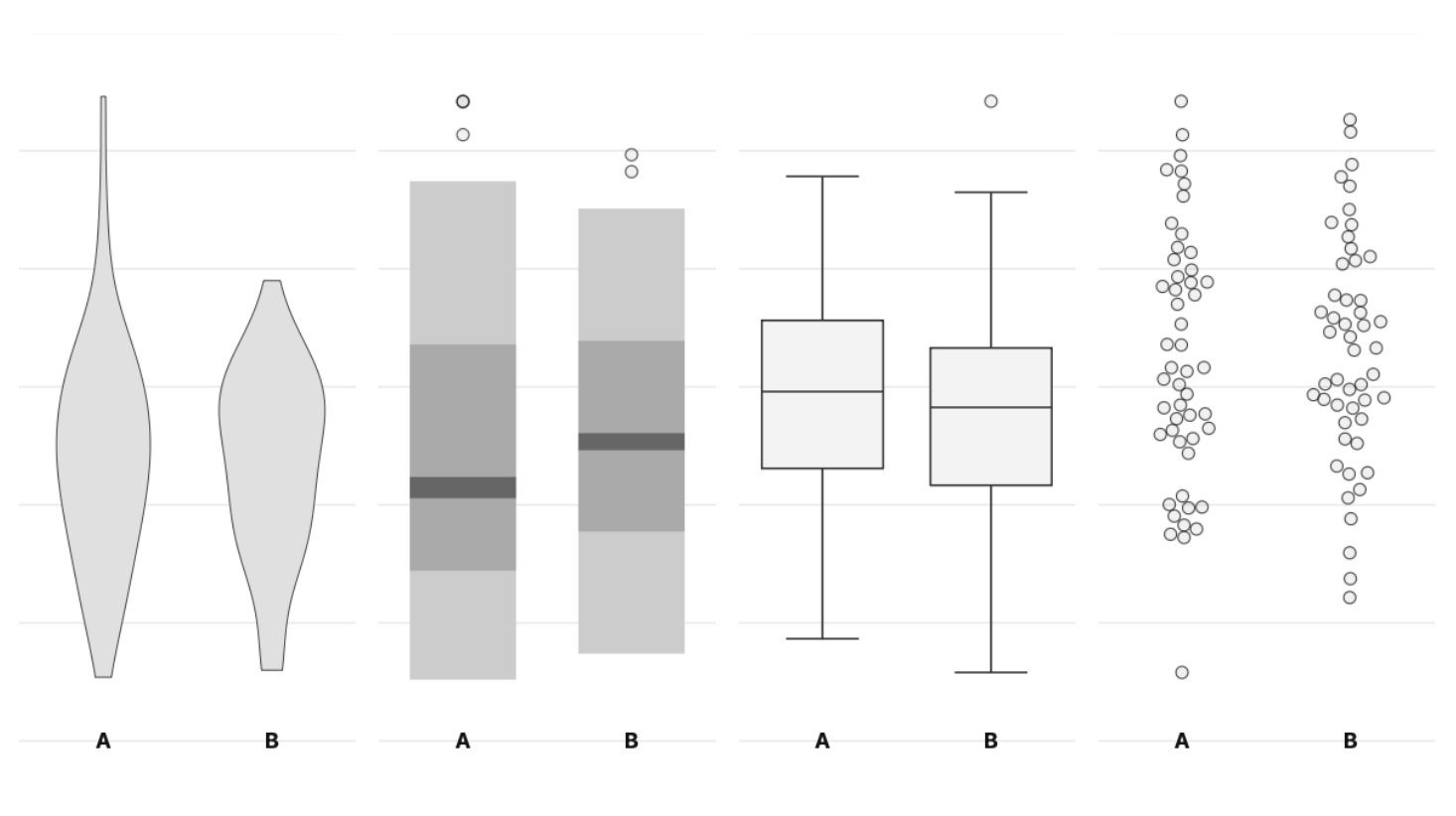
Jittering baguette prices
Exploring how to show 1500+ individual data points when many of them have the same values, using baguette prices.
-

Pseudo-log axis in the wildlife
Combining a pseudo-log axis, dot jitter and a nontrivial model all in one chart.
-

Transit ridership data
What to do with 25 years of monthly transit system data? How about try to identify college towns based on ridership trends.
-

Convert to CSV webapp
In my hobby of digging into data shared by research articles, I sometimes encounter data file types I can’t read directly, so I built this webapp to help.
-
Visualization study webapp
The start (and end?) of my adventure in online data visualization research, with some preliminary results.
-

-
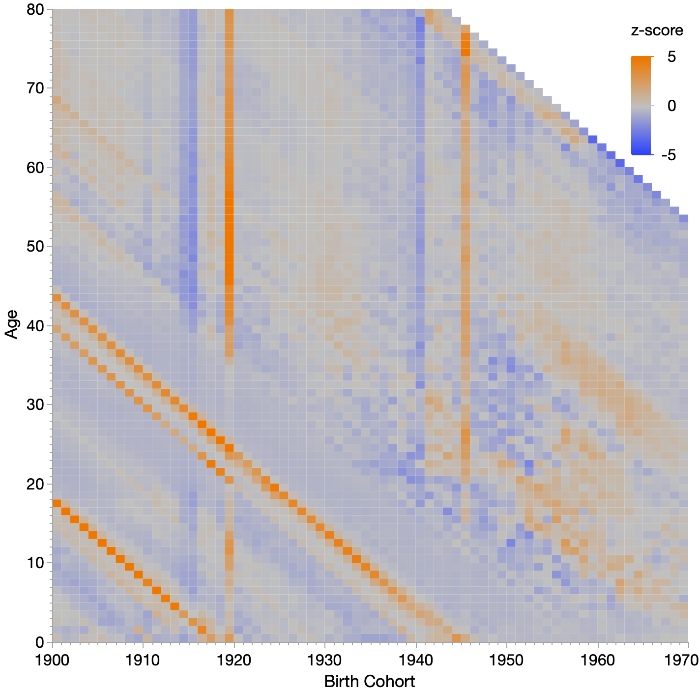
Bad year to be born
Using data from the Human Mortality Database, I find some interesting patterns regarding good and bad years to be born.
-

Seeing Uniformity
I tracked two-digit authentication codes for two years after suspecting a subtle bias toward higher values. Using simple visualizations, standard statistical tests, and simulation as a reality check, this post explores how easy it is to see structure in randomness and how hard it is to prove it.