

-

Seeing Uniformity
I tracked two-digit authentication codes for two years after suspecting a subtle bias toward higher values. Using simple visualizations, standard statistical tests, and simulation as a reality check, this post explores how easy it is to see structure in randomness and how hard it is to prove it.
-

Data Strips: Quintiles vs. Box Plots
Experiments with a new “quintile area” strip plot, prompted by skewed box plots in a biology paper, ended up clarifying why box plots remain so robust.
-

-

From radar charts to curve fitting and back
An exploration of radar charts from a recent Nature article, tracing the path from radars to fitted sigmoidal curves to alternate derived summary views.
-

Beeswarm attack
Here’s another case in the wild of beeswarm jitter using clamped bounds that hide the distribution of the data. This one has a twist in that a large proportion of the data values are zero.
-

NCAA football team draft rates
Comparing NCAA football players’ NFL draft rates with their high school composite ratings
-
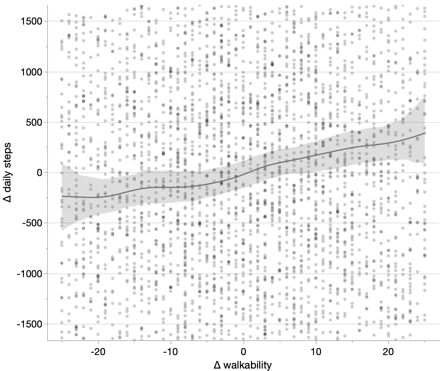
Step count versus city walkability
Someone once quipped that I only read journal articles by looking at the pictures. I admit the graphs are the first things I look at. Next I check the data availability statement, to see if I can better understand the graphs with a little exploratory analysis. After that, I might also read the text of…
-

Data extraction challenge
Throughout my quests for raw data, I’ve learned a few techniques for find data lurking behind the charts. This walk-through shows a few of them,
-

Data Strips Experiment
I built a “Data Strips” app to experiment with new ways of graphically summarizing the distribution of a single variable.. You can try it out or access the code on GitHub. This post will introduce the app and summarize the views.
-

Ternary data vs ternary chart
Do the insights gained from ternary data organization require a ternary chart?