

-

Regression with a ranged interval variable
How reproducible are studies with shared data? I collect one more data point in a quest for the answer, and make a side exploration into a linear regression conundrum.
-

Case study on wide scales
Five alternatives to a broken axis scale for data visualization’s wide scale problem, and a broken line chart tip.
-

Danger of quadratic extrapolation
Any investigation into small R² values leads to a different finding about extrapolation.
-

Smoothing Star Trek gender ratios
A study of gender balance in Star Trek dialog leads to an adventure in data cleaning and a smoothing revelation.
-

-

Mapping Choices
A study of a map of wine consumption reveals many underlying choices, both cosmetic and substantive.
-

Anscombe’s Quartet Escapee
When a linear fit doesn’t look right, should we use it anyway? Let’s not — here are some alternatives.
-
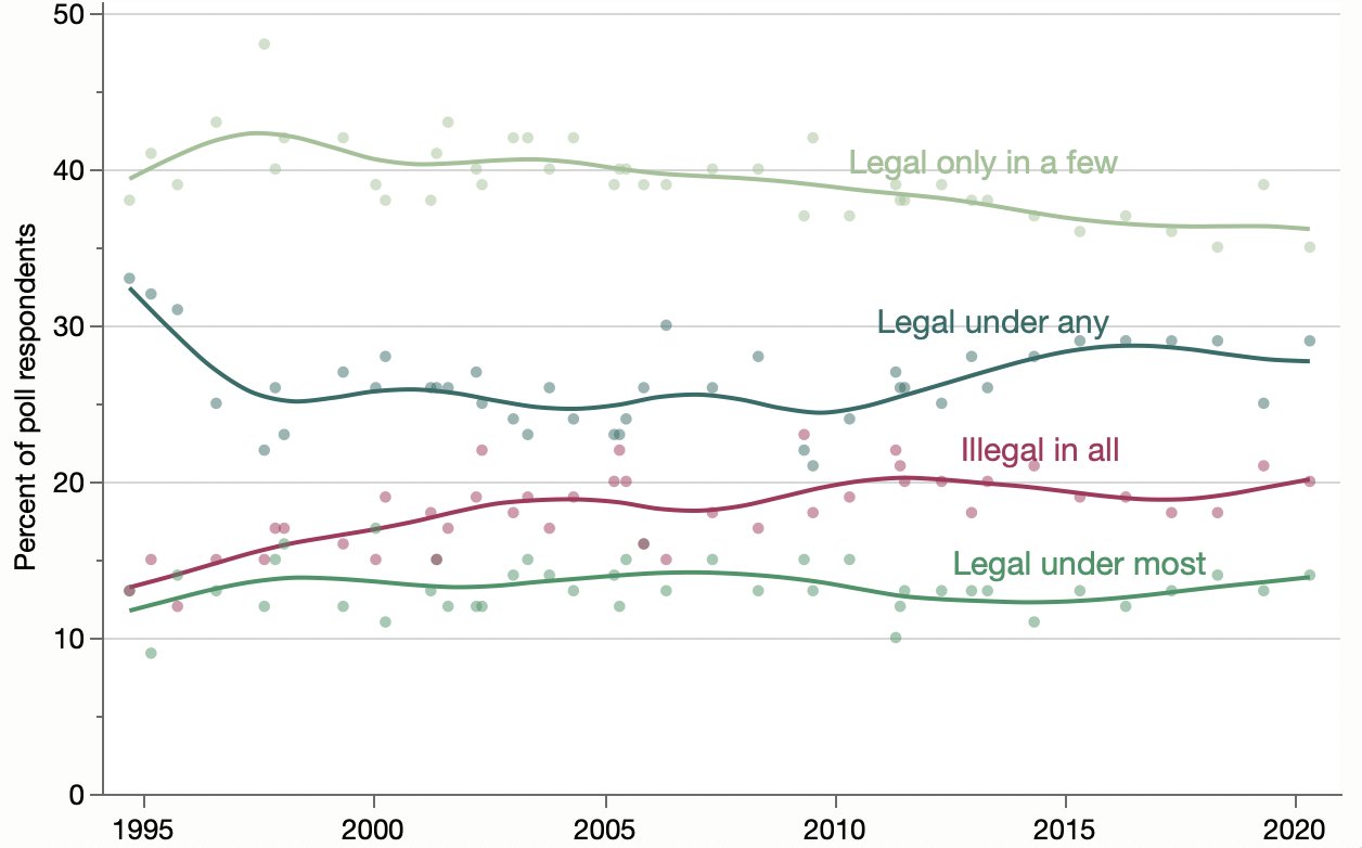
To stack or not to stack
That is the question. Or is it about the value of the individual responses versus combined responses? And don’t forget to smooth.
-

Querying Census Bureau for Divorce Rates
Trying to remake a divorce percentage chart led me learn about the new Census Bureau table query interface to its Public Use Microdata.
-

Suicides and Covid-19
Looking at the raw data behind two recent studies of early suicide counts during the Covid-19 pandemic gives me a chance to try out a “moving box plot” since the data is a bit sparse for regular confidence intervals.