
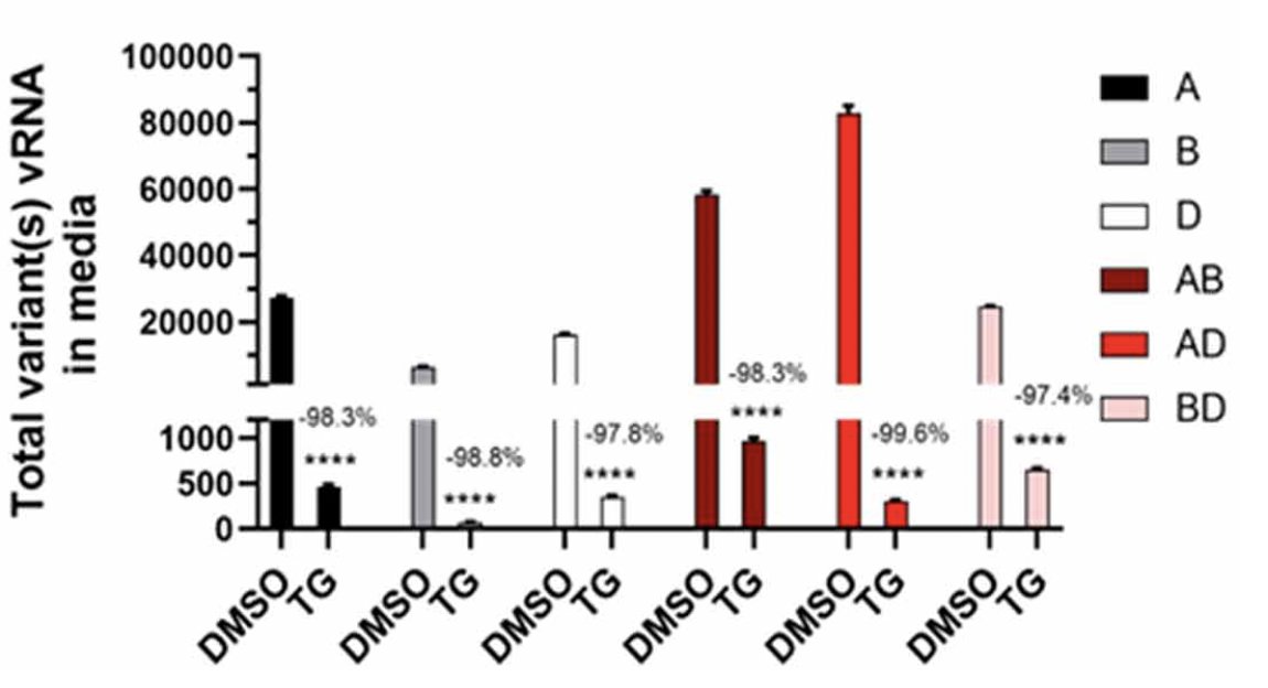
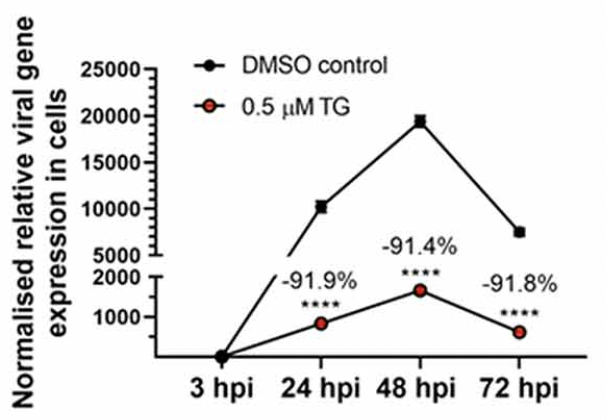
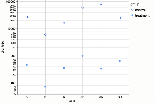
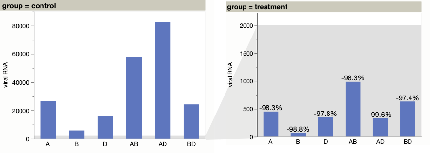
The paper Emergent SARS-CoV-2 variants: comparative replication dynamics and high sensitivity to thapsigargin caught my attention because of the prominent use of broken scales. Here are just two of eight charts in the paper using broken Y axis scales. Is a broken scale good, bad, or the least bad of a set of bad alternatives?
I remember going to a talk many years ago from Rachael Brady, then head of the Duke data visualization lab, where she cited wide scales as one of the top challenges in data visualization. (She actually said it was one of two top challenges, but embarrassingly I can’t recall the other. Maybe choropleth map sizing?) By wide scales, I mean scales that span several orders of magnitude. The reason it’s a challenge for data visualization is that data visualization gets its power from leveraging our baked-in visual perception systems and those systems are optimized for linear or near-linear scales that occur in nature.
Adding a break to the axis scale is one way to deal with wide scales, as demonstrated in the paper. Breaks are often discouraged because:
- It’s not always obvious to the reader, so they may misread the graph.
- Some graph elements lose their visual encodings when the scale is broken.
Starting with the second item for this paper, the bars in the first chart lose their length encoding and the lines in the second chart lose their slope encoding. On the bright side, since these encodings span the break, the scale break itself becomes more obvious, so the first complaint is not so relevant here.
It’s not great to lose those encodings, but given that the wide scales are inherent in the data and can’t be avoided, maybe the scale breaks are the least problematic of the alternatives. I tried a few alternatives myself to get a better appreciation of the issue.
Linear scale
A linear scale usually doesn’t work for wide scales since the small values become indistinguishable. However, these values span only a couple orders of magnitude, so maybe we can make the graph tall enough to see the large and small values on a linear scale.
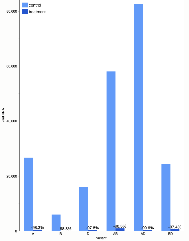
Not bad, though I’m sure most journals wouldn’t welcome such a tall graph.
Area
Sizing objects by area means the width and height only vary by the square root of the original scale. So an original scale of 1:2500 only needs 1:50 scaling in X and Y when using area. Treemaps and bubble charts are graph types where area is used for encoding. Here’s a bubble chart of sorts, using square bubbles.
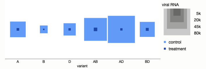
The values from the two groups can be nested since one is always smaller than the other in this data, but that’s not always going to be the case, so two rows of sized squares would be the more general case.
Log scale
A log scale is the frequent panacea for wide scales, but log scales have similar drawbacks to broken scales. It’s not always obvious and it’s not something our visual system understands. I prefer to reserve log scales for things that are exponential in nature; that is, where the relevant factor is the exponent. Perhaps that’s the case here given the exponential growth within cell cultures.
Adding the grid lines makes it clearer the scale is logarithmic. It easier to see here that the treatment and control groups are at similar proportions to each other for each variant level, since the vertical distances are similar except for the AD value.
Two graphs
The usual “proper” way to handle wide scales with with multiple graphs, each at a different scale. It’s at least most obvious than a broken axis and doesn’t lose any encodings, but, of course, it doesn’t fix the underlying unsolvable problem of comparing all the values visually.
My example leverages the fact that the large and small values are perfectly divided by the two groups. A more general approach would show values repeated in each graph, even if truncated or miniscule.
Log-wise linear
On Twitter, Dan Zvinca mentioned another possibility, which is to put the scales breaks in a regular pattern with a linear scale for each power of ten. Here’s my attempt at that.

It’s still a broken axis but has more regular rule-based breaks and still locally linear scales for comparisons within a panel.
More discussion
This is hardly a new topic and here are a few similar studies.
- Nick Desbarats: Visualizing Wide-Variation Data
- Jon Peltier: Broken Y Axis in an Excel Chart
- Tom Hopper: Graphing Highly Skewed Data
Broken lines
I will offer one insight that’s not so commonly discussed: if you must break a scale for a line graph, be sure the lines have the correct slope with each part.

For instance, in this example, the line from (2, 10) to (3, 2000) should be and is practically vertical in the lower frame because in that coordinate space, y=2000 is 200x higher than the y=10 point.