
How reproducible are studies with shared data? Apparently peer review doesn’t check such things and usually can’t since the data is often made public only on publication. So I like to try it, partly as a check on the reproducibility and partly to test my own tools and abilities.
I recently tried to reproduce some of the graphs in Data quality of platforms and panels for online behavioral research by Peer Eyal et al. Besides reproducibility, I’m also interested in trying variations on this graph, which shows linear regressions but with a nonlinear x-axis.

The data for the studies in the paper are shared on the Open Science Framework. The repository nicely includes both the surveys and all the responses that we analyzed. However, there is no metadata so it took a little effort plus Twitter and email exchanges with one of the authors to work out some of the encoding and computed variables that appeared in the graphs.
Before getting to the regression figure, I started with Figure 5 which also used the same response variable and should be easier to verify I had the right computations.
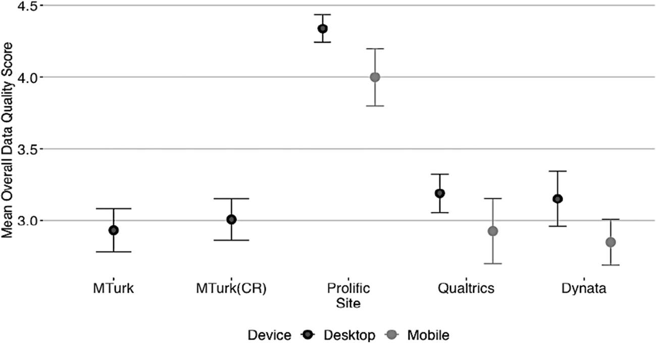
The closest I could get without help from the authors was:
Not terrible, but I should be able to get it correct since I have the raw data. A few questions I wasn’t sure about:
- What rows were excluded? I saw a column called duplicateID and got closer when excluded those, but were there others to exclude?
- What is the formula for the overall quality score response? The paper describes five components that are summed to get a 0-5 score but it’s not completely clear which data variables go into those components.
- What determines the desktop or mobile categories. The survey responses contain the browser OS identifiers and screen resolutions, and I assume the device type is somehow derived from one or both of those.
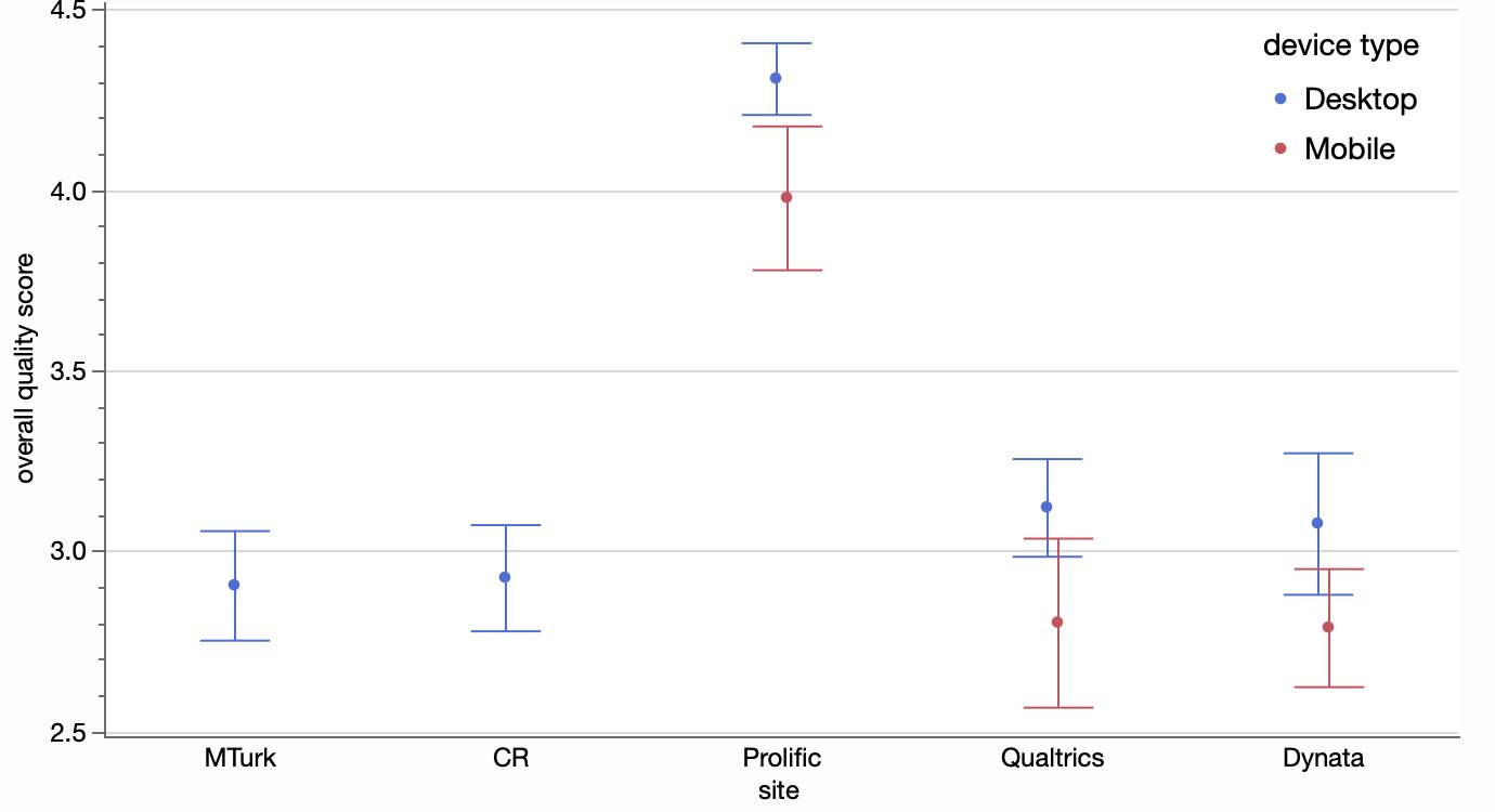
Fortunately, the authors responded to my Twitter query and sent me the R code they used for the analysis. My R is a little rusty but I was able to follow it enough to answer my questions and reproduce the figure.

I had only guessed correctly on the first of the three questions. For the overall quality score formula, there was one component that I decided was one of two variables in the raw data: Comp_Check_1 or Comp_Check_D_1. It turned out I was supposed to OR those flags together, and same for the Comp_Check_2 items. That accounted for most of my error. I also had a couple device type mappings wrong, but that only affected a handful of the responses. I had treated the OS called “wv” as mobile instead of desktop because I thought it was an Android variant but still not sure.
With that figured out, I could be more confident in exploring the regression figure using the same response variable. It’s the x-variable that’s interesting though. It’s really an ordinal variable from a question asking about time spent on the platform with the following possible responses.
- Less than 1 hour per month (1)
- 1-2 hours per month (2)
- 1-2 hours per week (3)
- 2-4 hours per week (4)
- 4-8 hours per week (5)
- 8-20 hours per week (6)
- 20-40 hours per week (7)
- More than 40 hours per week (8)
I suspected the regressions were performed on the ordinal levels (in parentheses) rather than the hours amount, and I can confirm that by pretending the levels are continuous and applying regression line fits:

While it does seem odd to treat the ordinal ranges as continuous, I wouldn’t be surprised if this is common practice in some survey analysis. It does provide some information about whether the score is affects by increasing range categories. And since the ranges are doubling (or almost doubling) at each step, the regression can be thought of as the effect of log(hours) on score.
We still have to decide which value in the range of hours to take the log of. Since the original chart used the min of the range for its axis labeled, here’s a regression plot of score versus log(min hours), and it’s very similar to the previous chart.

Of course, a linear fit only provides a coarse level of fitting. How about a spline smoother, you ask?!

Looks like a different pattern, at least for the first two blue fits. Blue, by the way, is for more casual users of the platform (main source of income == 0).
Now you’re wondering about the data points. For that, it’s best to separate the overlaid curves into their own panels.

We can at least see the initial high flourish in the second panel of the top row is only based a couple data points and not to be trusted (fortunately, the wide confidence band was also telling us that). It’s suspicious that some respondents who said the platform was their main source of income (red dots) also reported spending an hour or less a week on the platform.
Though the log-spaced ranges may have been more convenient for the survey responses, the linear relationship still seems interesting for analysis.

This time, I used the midpoint of each hours range, with 50 for the 40-or-more response.
While it’s been interesting to exploring the alternatives, it’s hard to interpret the results since the respondents with low quality score are also more likely to have bogus responses for the hours and income questions. I believe the second study in the paper tries to deal with respondent quality more preemptively. Offline, one of the authors suggested a categorical bar chart instead of a regression line chart may have been better.

At least it doesn’t suggest the linear continuity. I had to clip some of the extreme confidence intervals, so it’s not indicated how some of the bars are based on very few responses. One view that shows both the response values and the counts decently is a simple heatmap.

I’ve veered from reproducibility into exploration mode, but I’ll return to reproducibility now. I was able to faithfully reproduce these figures (and a few more not included here), so it was mostly a success. It would have been better if I didn’t need extra help from the author, but I likely could have figured those issues out on my own with more study.